YouTrip reimagined
Consumer fintech
Just-for-fun • 2022
Improving usability and engagement in a multi-currency travel wallet
A speculative redesign of YouTrip, a multi-currency wallet app, focused on improving usability, discoverability and ongoing engagement beyond travel periods.
Through a heuristic evaluation and IA audit, online reviews and a user survey, I traced why useful features were going unused – then redesigned the experience around a real-time exchange rate table, an in-app converter, and a discoverable Perks system.
Type
Speculative redesign
Scope
IA • Flows • UI
This project is speculative and was independently undertaken as a personal initiative – not affiliated with YouTrip in any way.
Background
A travel wallet with features but no clear path
YouTrip is a multi-currency travel wallet with a solid core proposition — but its information architecture had grown without a clear organising principle. Features were discoverable only if you already knew they existed.
Three things stood out:
A clunky payment experience
During my own travels, paying on the go felt slower and more uncertain than it should.
A stagnant wallet experience
Negligible updates to the core wallet since 2018.
Disjointed engagement channels
After COVID-19 restricted travel, features like Perks for partner discounts, a regular blog and Telegram updates were added to drive engagement – but access to them was scattered.
I decided to explore how YouTrip could stay useful to travellers, both during and outside travel periods.
research
Where the experience breaks down for users.
I started with my own frustration, then checked it wasn't just me. Reviews on the iOS App Store, Google Play, and Seedly echoed the same friction.
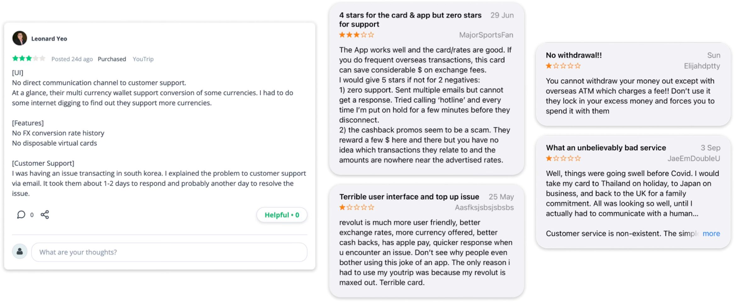
Select review snippets taken from the iOS App Store, Google Play Store and Seedly review forums
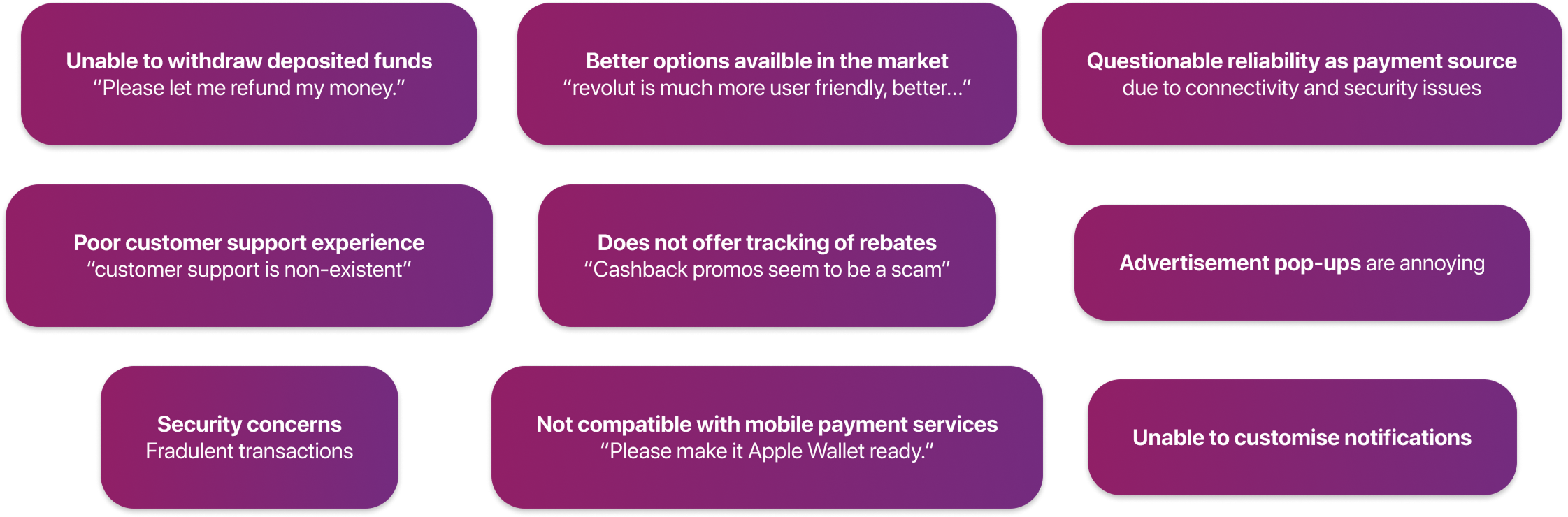
Summary of common feedback observed
Reviews also surfaced deeper complaints – withdrawals, reliability, customer support and no mobile-wallet support. These are real, but they're backend and service-level problems that a UX redesign can't fix, so i deliberately scoped them out and focused on the usability and engagement gaps that I could move.
Reviewers kept comparing YouTrip to “better” alternatives, so I mapped the market. The takeaway was simple – YouTrip's edge isn't feature count; it's being the free and simple option for travel payments. Whatever I changed had to protect that.
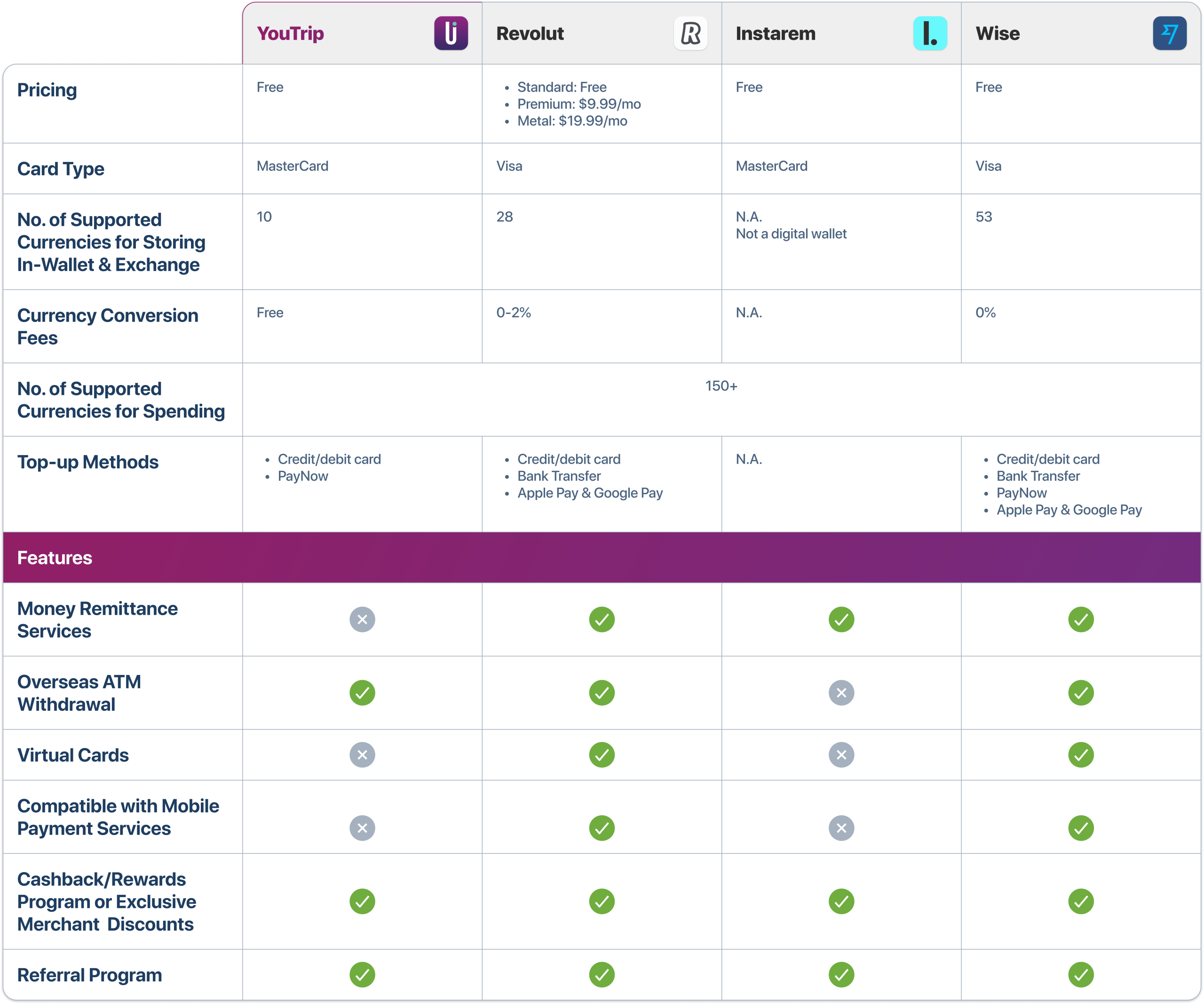
YouTrip's position in the multi-currency wallet market
To move from "people complain" to "people behave like this", I ran a short online survey.
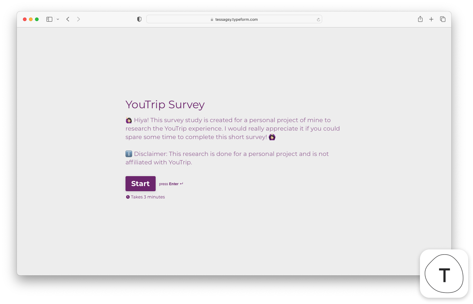
Online survey using Typeform
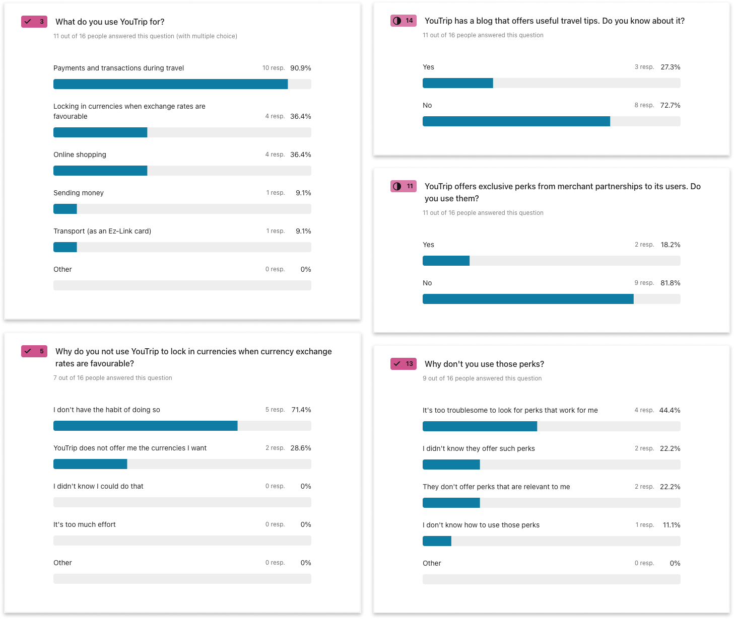
Survey response snippets
Four findings shaped the rest of the project:
Travel payments are the core use
Most used YouTrip mainly for travel, far less for everyday online shopping
In-app rates went unused
~70% Googled exchange rates instead of checking in-app
Perks were underutilised
Due to poor discoverability and onboarding
Almost no one knew about YouTrip’s blog
Only 27.3% were aware of it, despite active marketing
The pattern: The features meant to add value beyond travel (rates, perks, content) were the ones users couldn't find or didn't trust enough to use.
The audit
Issues identified from heuristics & IA evaluation
Evaluating the existing app structure and screens reveal an app extended feature by feature, without revisiting how those features relate to each other – or to the user's primary job-to-be-done.
EXISTING STRUCTURE
Feature-led. Partnership perks (Insurance by HL Assurance) had it’s own entry point as a separate Navbar tab, despite being a Perk – which already had a tab.
real user goal
Travel with financial confidence – Spend well-informed and at ease, in the right currency.
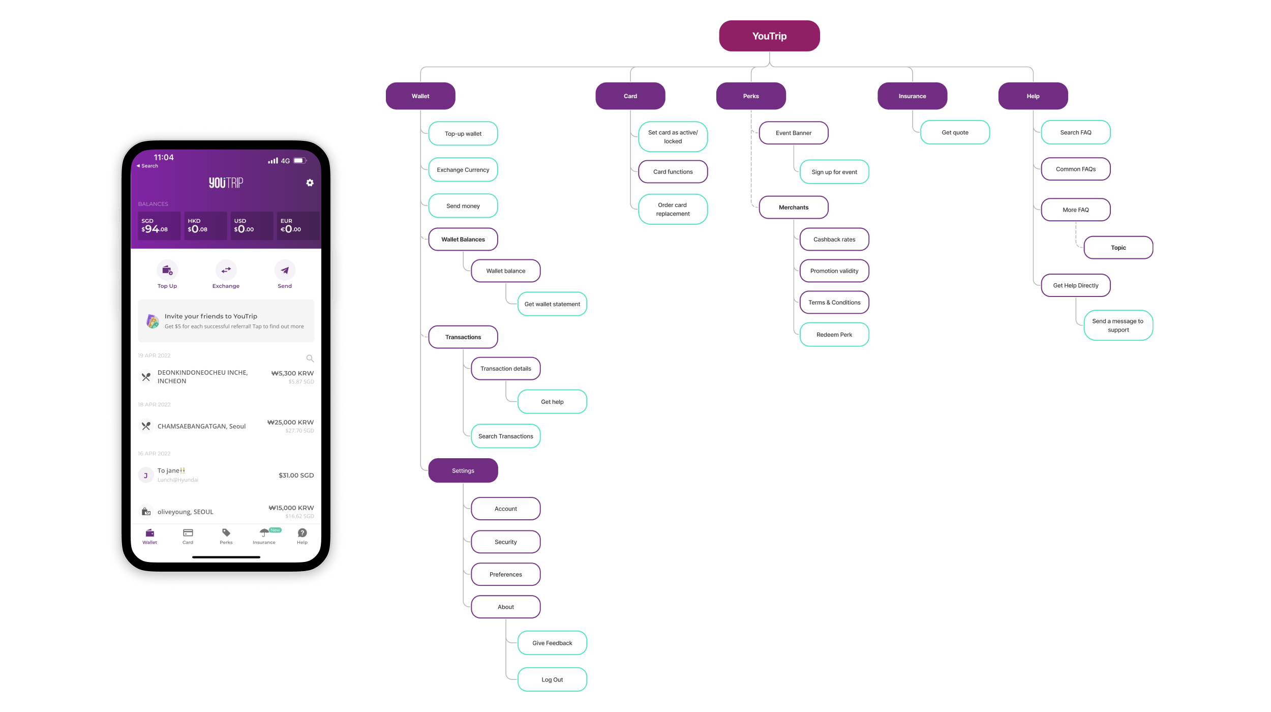
Existing IA
The audit explained why the survey findings happened:
Low convenience
No easy overview of exchange rates across currencies (→ why people Googled rates).
Lack of customisability
Wallet order couldn’t be personalised according to travel needs.
Poor discoverability
Essential functions like transaction search were hidden due to poor contrast
Sub-optimal IA
The Card nav item took up an entire tab in the nav bar despite few controls; Insurance occupied another, though it's really a ‘Perk’.
Define
Key opportunities and problem statement
I synthesised the research into a persona and journey map to pinpoint where YouTrip failed as a go-to travel payment mode.
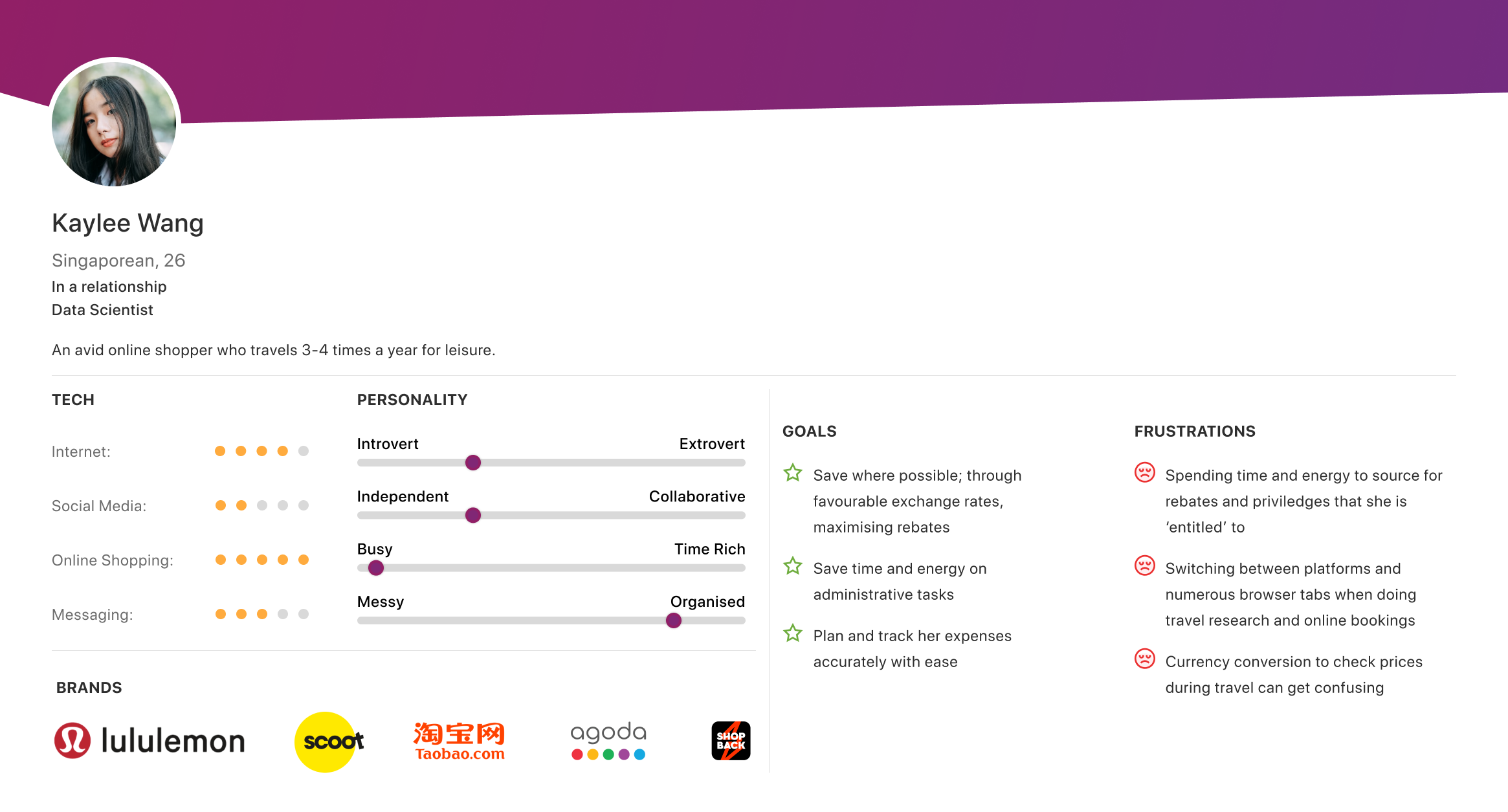
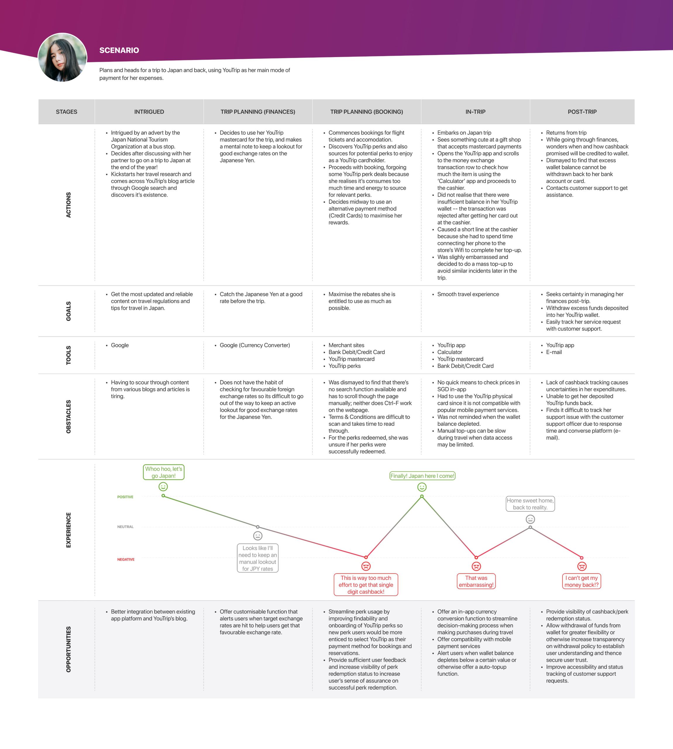
Persona and journey map identifying key opportunity areas.
Problem statement
How might we transform YouTrip from a travel-only utility into an engaging financial tool that delivers value both in and outside travel, while preserving its market position as the simple, fee-free option for travellers?
This pointed to three opportunity areas, each tracing directly back to a finding:
Currency management transparency
→ Rates unused, IA confusion
- Improve navigation architecture
- Enhance onboarding for new and existing features
Feature discoverability and engagement
→ Rates unused, no customisation
- Surface direct, accurate exchange rates in-app
- Support decision-making for currency conversions and overseas cash withdrawals
- Allow personalisation of currency wallets
Value beyond travel
→ perks & blog unused
- Improve the usability of Perks
- Increase visibility of cashback and rewards to incentivise usage
Ideation
Translating opportunities into features
Key feature addition
Real-time exchange rate table
At-a-glance visibility of all supported currencies; differentiates exchange currencies from others
Key feature addition
Calculator
Quick in-app price conversions to support decisions when exchanging or withdrawing abroad
Key feature addition
Enhanced Perks
Search, filtering and categorisation, plus a visual tracker for cashback earned – to incentivise use and make rebates transparent
Bonus feature
Auto Top-up
Reduce friction when connectivity is poor
Bonus feature
Integrated marketing content
Folds YouTrip's blog into the experience
Bonus feature
In-app customer service
Faster support liaisons
With these in mind, I rebuilt the site map as a base for the redesign, then moved into sketches and wireframes.
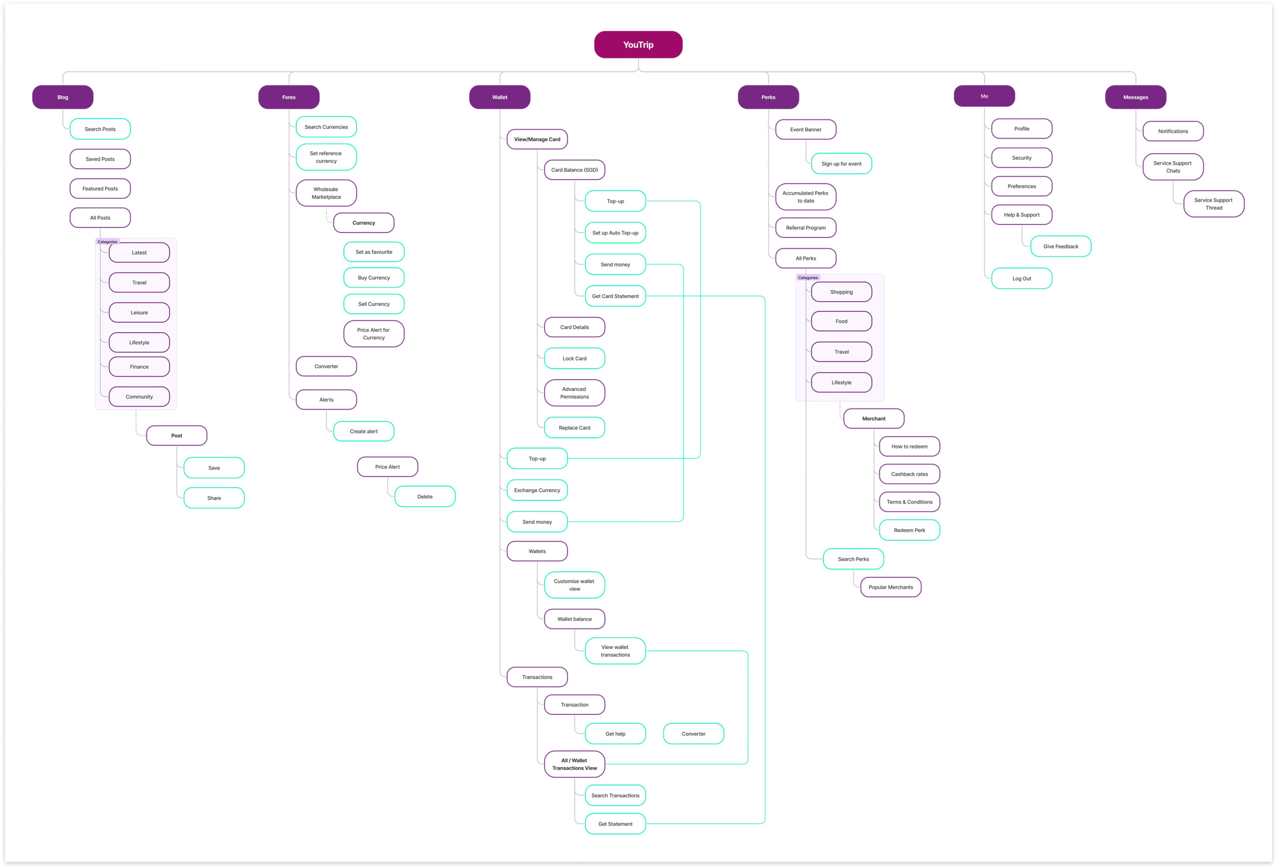
Re-vamped site map
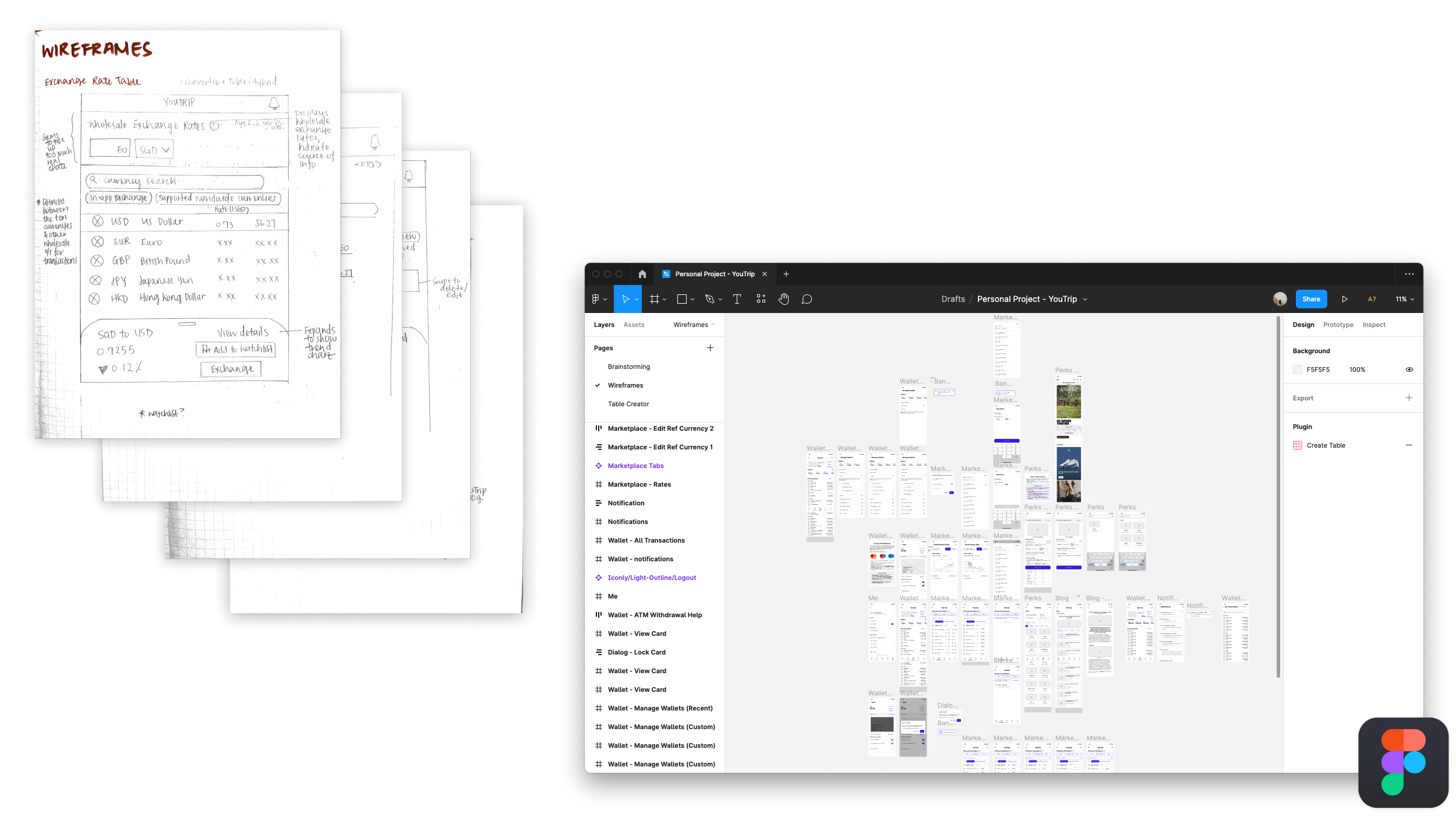
Initial sketches on pen and paper and digital wireframing on Figma
Testing & iteration
Validating the redesign with users
I ran an unmoderated remote usability test with five YouTrip users as participants, who were encouraged to record their screens and turn on their cameras as they worked through tasks.
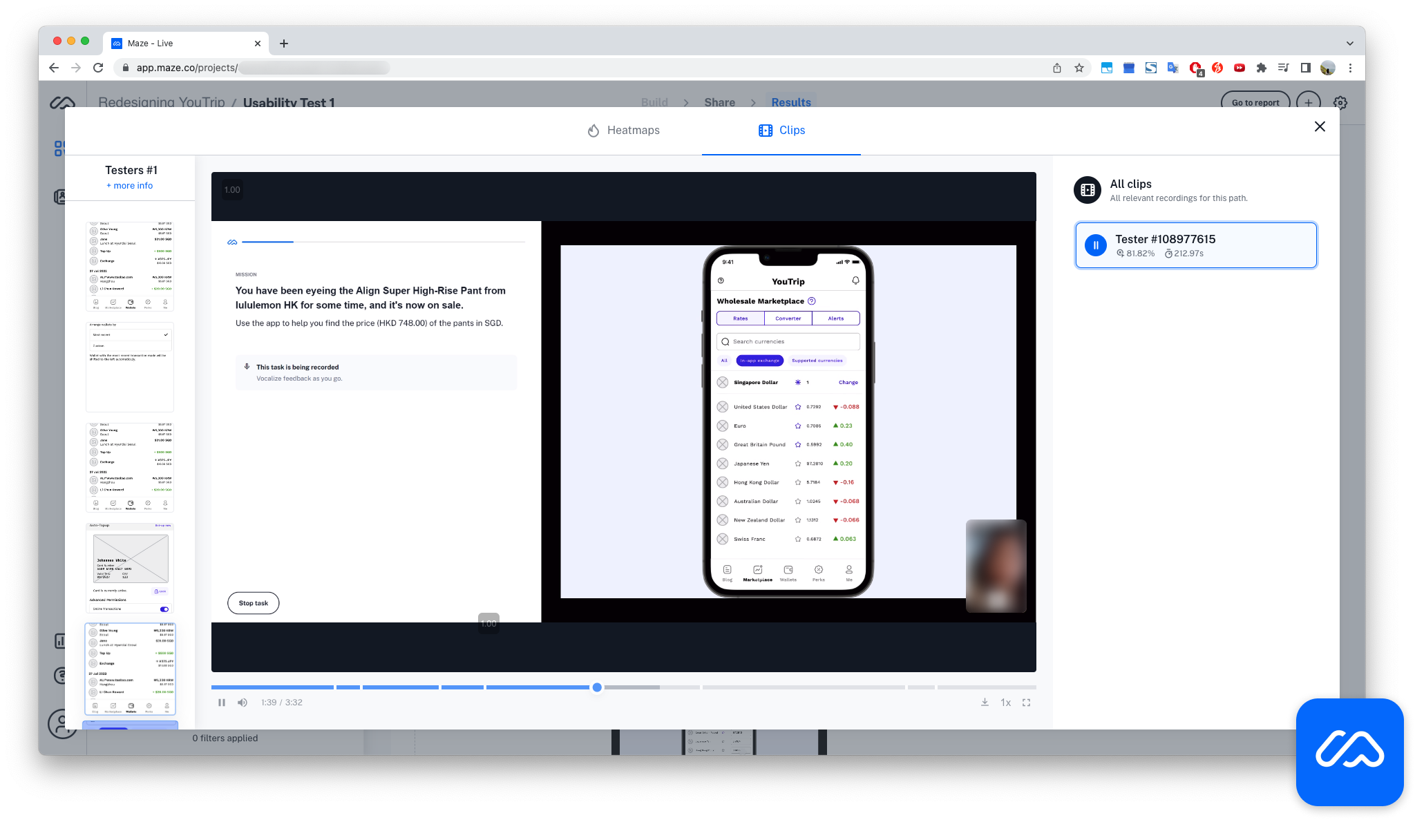
Participants were encouraged to enable permissions to record as they work through their tasks.
Two issues surfaced
Navigation labels lacked clarity
New nav items weren't discoverable – the ambiguous 'Marketplace' label being the main culprit.
Onboarding gaps
Users skipped important 'How to' instructions when using Perks.
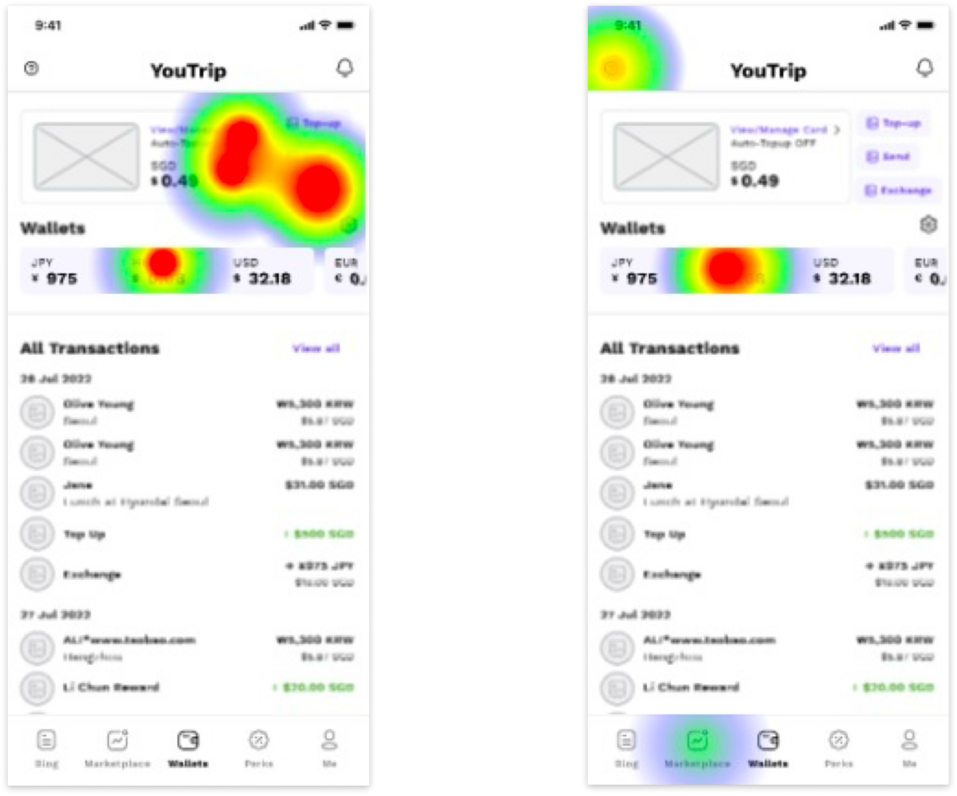
Users typically did not discover the newly introduced 'Marketplace' tab and instead reverted to the app's existing entry points for exchange rates.
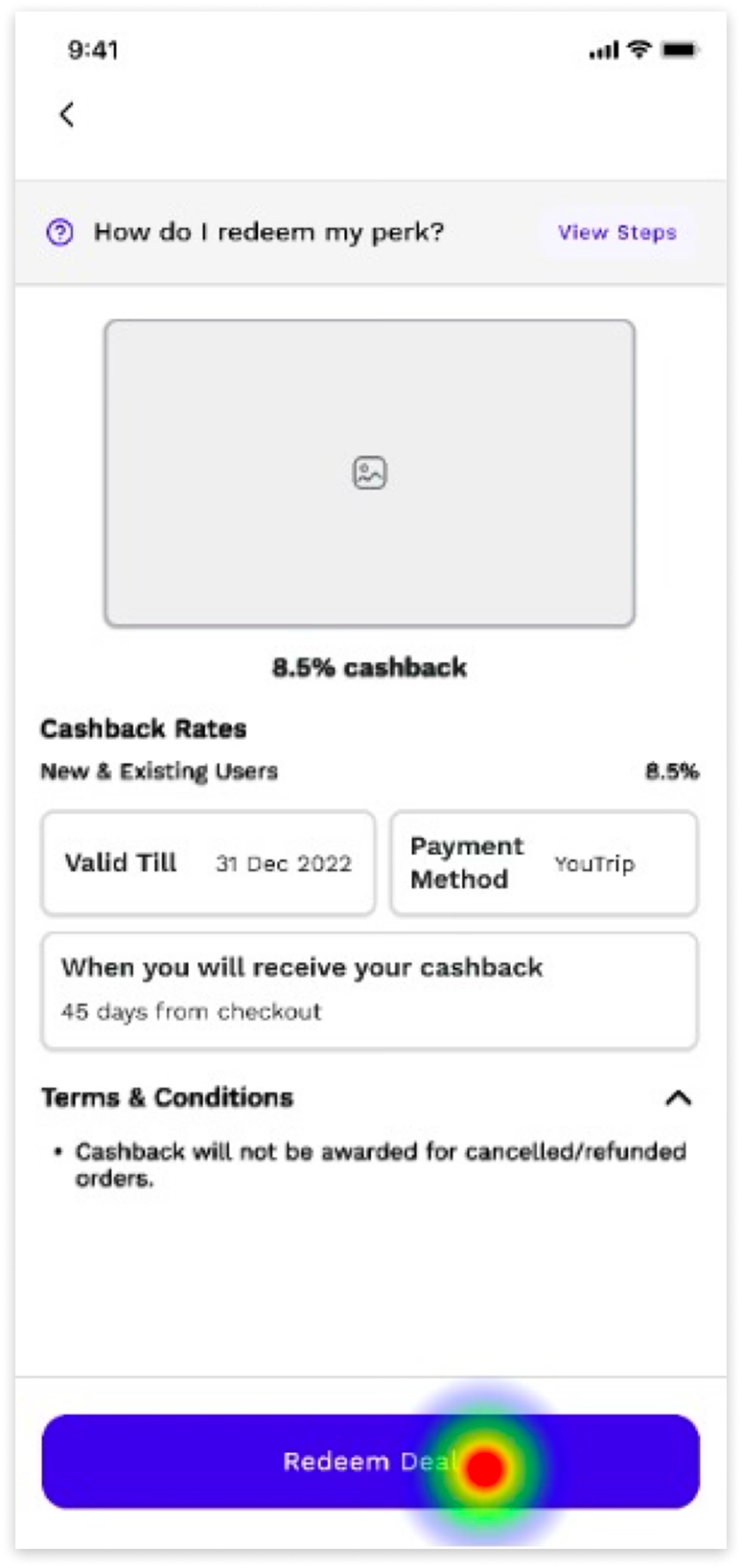
Participants skipped past "How to” steps when redeeming perks.
Refinements based on testing
01
Introduced progressive onboarding overlays to highlight new features
02
Refined label copy to improve clarity (i.e. Retiring "Marketplace").
03
Integrated instruction steps into critical moments during perk redemption, so instructions are hard to miss
Solution Highlights
The final design synthesises the research insights and testing feedback into a renewed experience that addresses the problem statement while maintaining YouTrip's visual brand identity.
Real-time exchange rate table & Converter
A comprehensive dashboard that:
- Provides at-a-glance visibility of all supported currencies
- Differentiates between available exchange currencies and others
This directly targets the behaviour the survey exposed — users leaving the app to check rates elsewhere.
Calculator
An in-app calculator for:
- Quick conversions and
- Informed decisions when exchanging currency or withdrawing at ATMs
This removes friction in foreign currency decisions during travel.
Enhanced Perks & onboarding
A reimagined perks experience with
- Search and filtering,
- Logical categorisation,
- Improved onboarding, and
- a visual tracker of total rewards earned.
This transforms Perks from an afterthought into a core part of the value proposition, driving engagement during non-travel periods.
Solution Highlights
Clickable prototype
Feel free to click around the prototype below, which also features bonus flows – auto wallet top-up, integrated marketing content, and customer-service chat:
Reflections
An closing note
Learnings
Stage usability tests carefully. It was my first unmoderated, remote test. Even with established tools like Maze, setting clear expectations for participants improves test outcomes.
constraints
Limited user access. Survey size was small (<20 users) and skewed towards tech-savvy adults.
Testing medium mismatch. YouTrip is a mobile app, whereas Maze is desktop-first – which creates distanced testers from the real experience.
What's left out
Beyond UI/UX, a dive into online user reviews on the YouTrip experience also revealed that trust in the platform needs strengthening, though that will require backend and service-level enhancements.
Other Works
Customer Profile ModuleEnterprise Design
Customer Data ManagementEnterprise Design
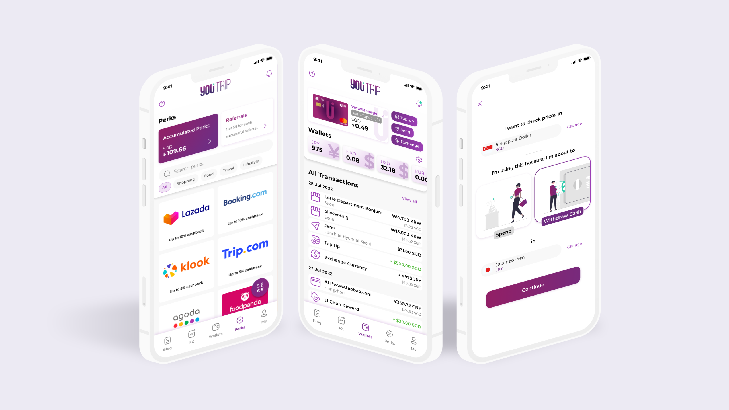
YouTripPersonal project
Think we're a fit?
Let's Connect!
©️ 2026 Tessa Goh